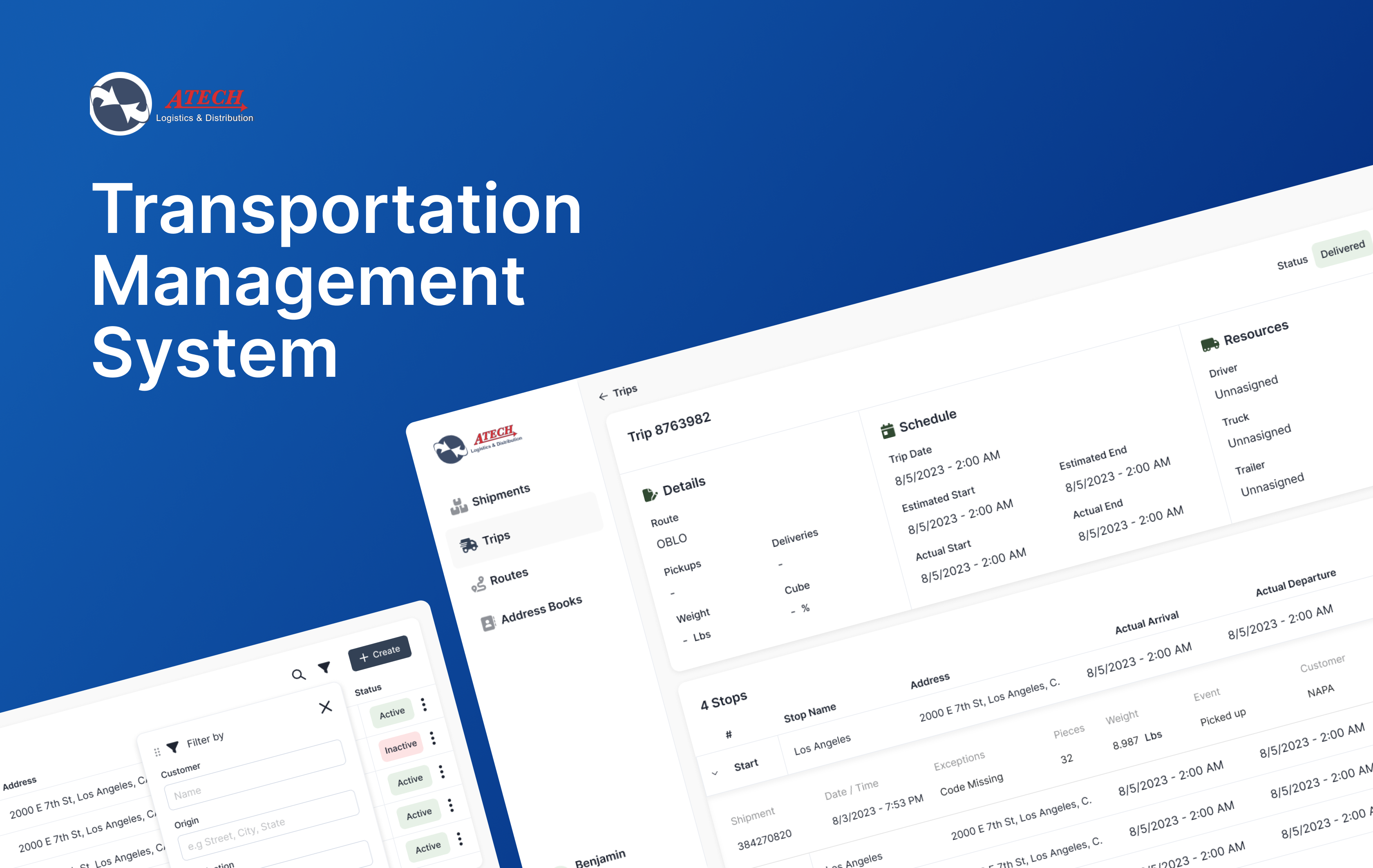
Story of how UX affects efficiency in logistics and distribution systems.
Role: UX designer
Date: Jul 2023 - Nov 2023
Industry: Logistics and distribution
ROI: Reduction in dedicated trips, increase route efficiency and decrease in trip planning time.
Context
Atech Logistics, Inc. is a third-party logistics (3PL) company that provides fully-customized dedicated transportation solutions for businesses all across the United States. With multiple facilities located in the Western United States, Atech has earned a solid reputation of designing custom logistics solutions backed by the highest standards in customer service. In this project, we revamped a back office system to match new business needs and optimize the overall efficiency of the backend operations.
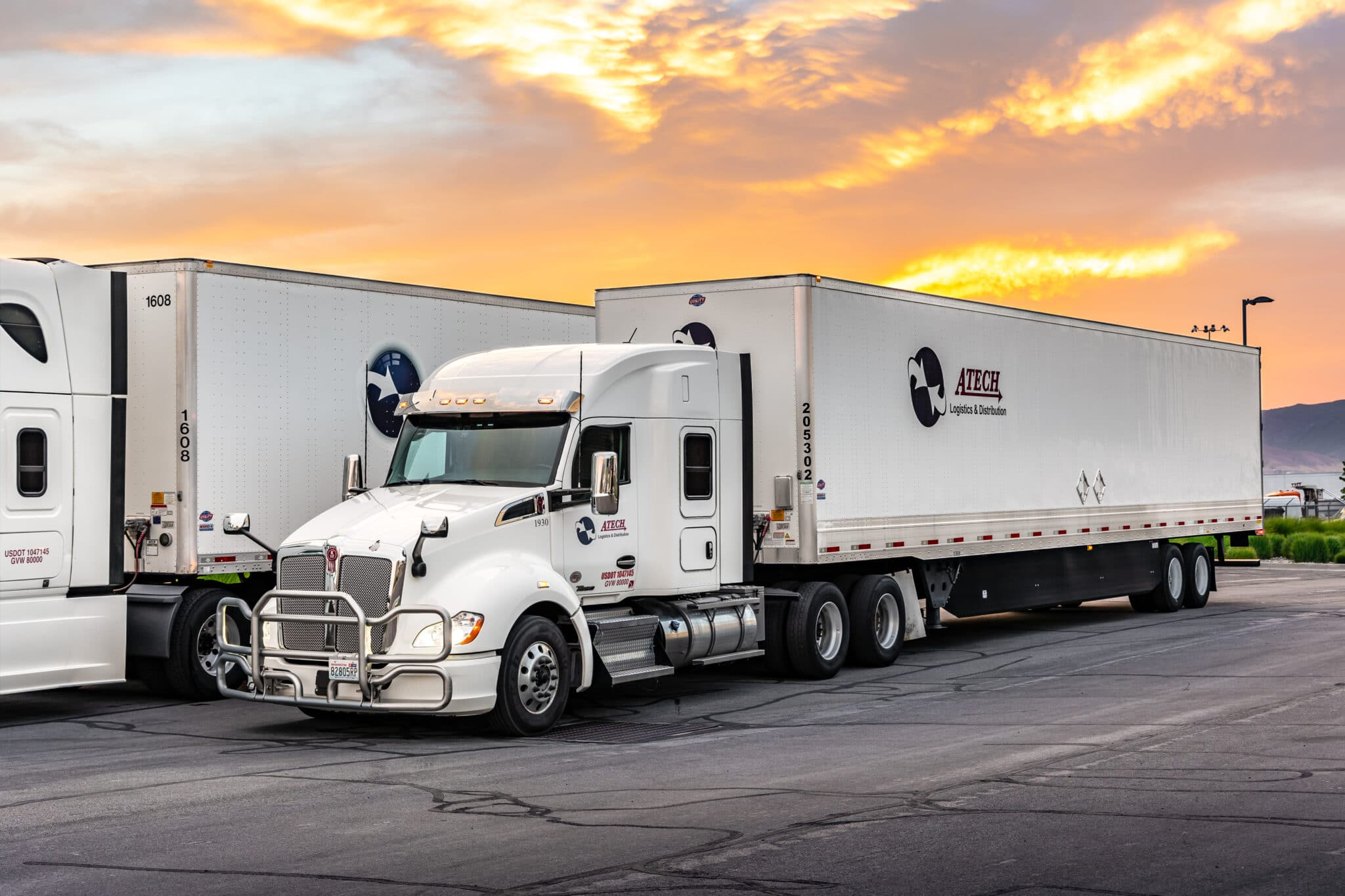
Truck Fleet
Business Problem
Because of new customer partnerships and surge in operational volume, the company needed new ways to assign and allocate shipments in order to reduce dedicated trips and increase route efficiency.
Solution
The solution requires upgrading the current software to a more robust system with funcionality
like shipment allocation, trip assignment, time tracking, document management and more.
The solution had to consider 3 important verticals for this operation.
1. Administrator portal:
A place where dispatchers can plan and assign trips based on customer’s shipment requests.
2. Customer Portal:
A place for customers to create shipment requests and visualize what the shipment status was in real time.
3. Driver Portal:
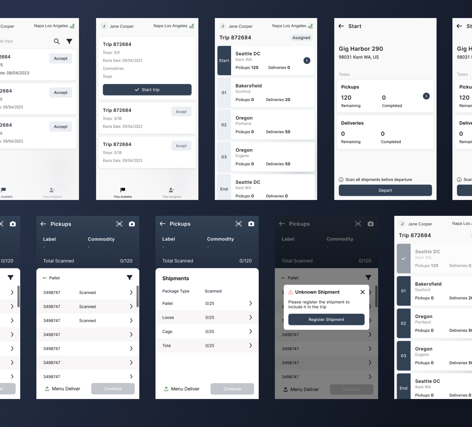
A mobile app that allows for drivers to see assigned trips, the route, stops and shipments that needed to be scanned, loaded or unloaded or every stop.
Discovery Process
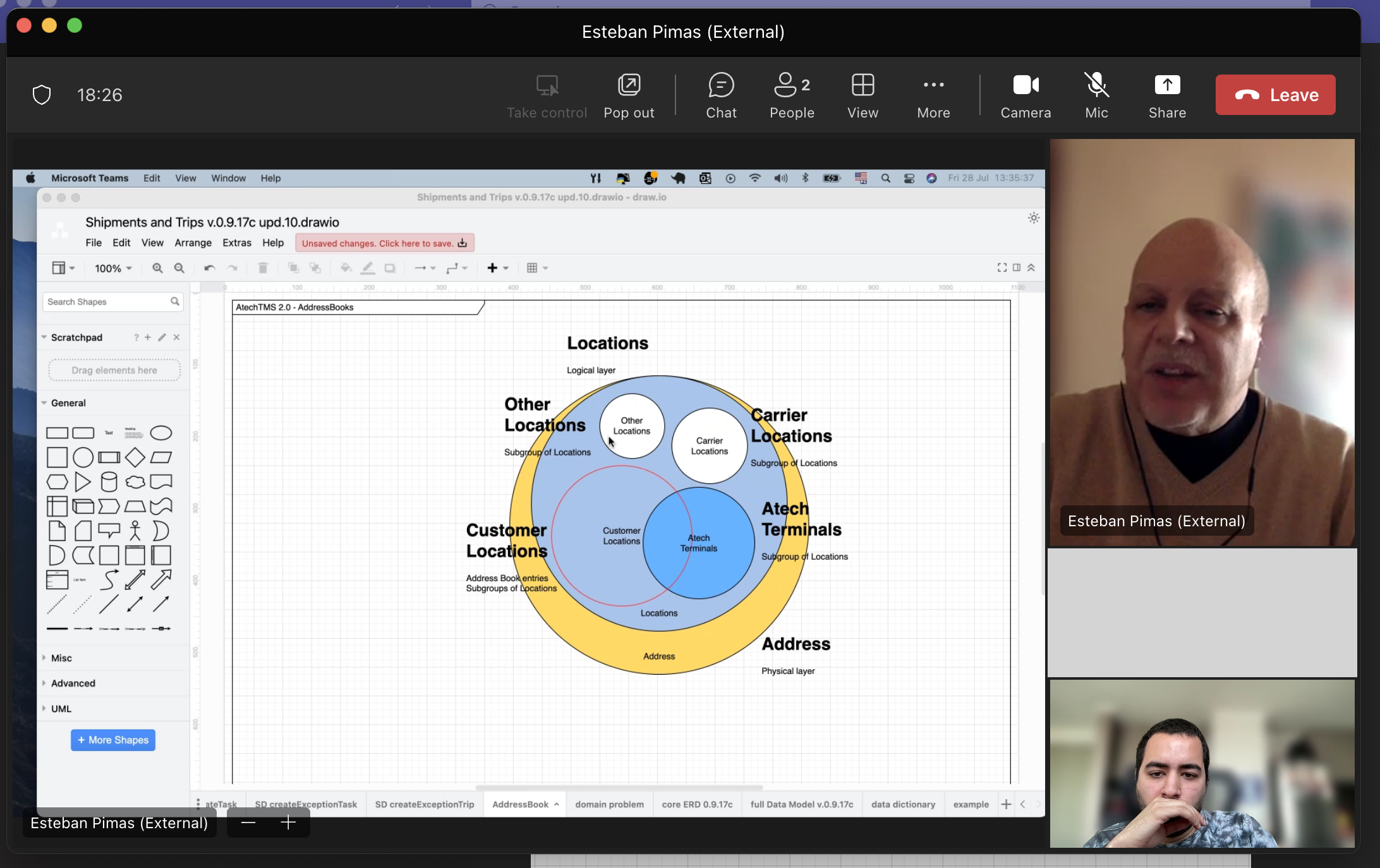
The design process started with a discovery phase to fully understand and map the current business logic, business entities, personas involved in the operation and well as a competitive analysis to asses different solutions in the market today.
Team Syncup
Personas

Journey
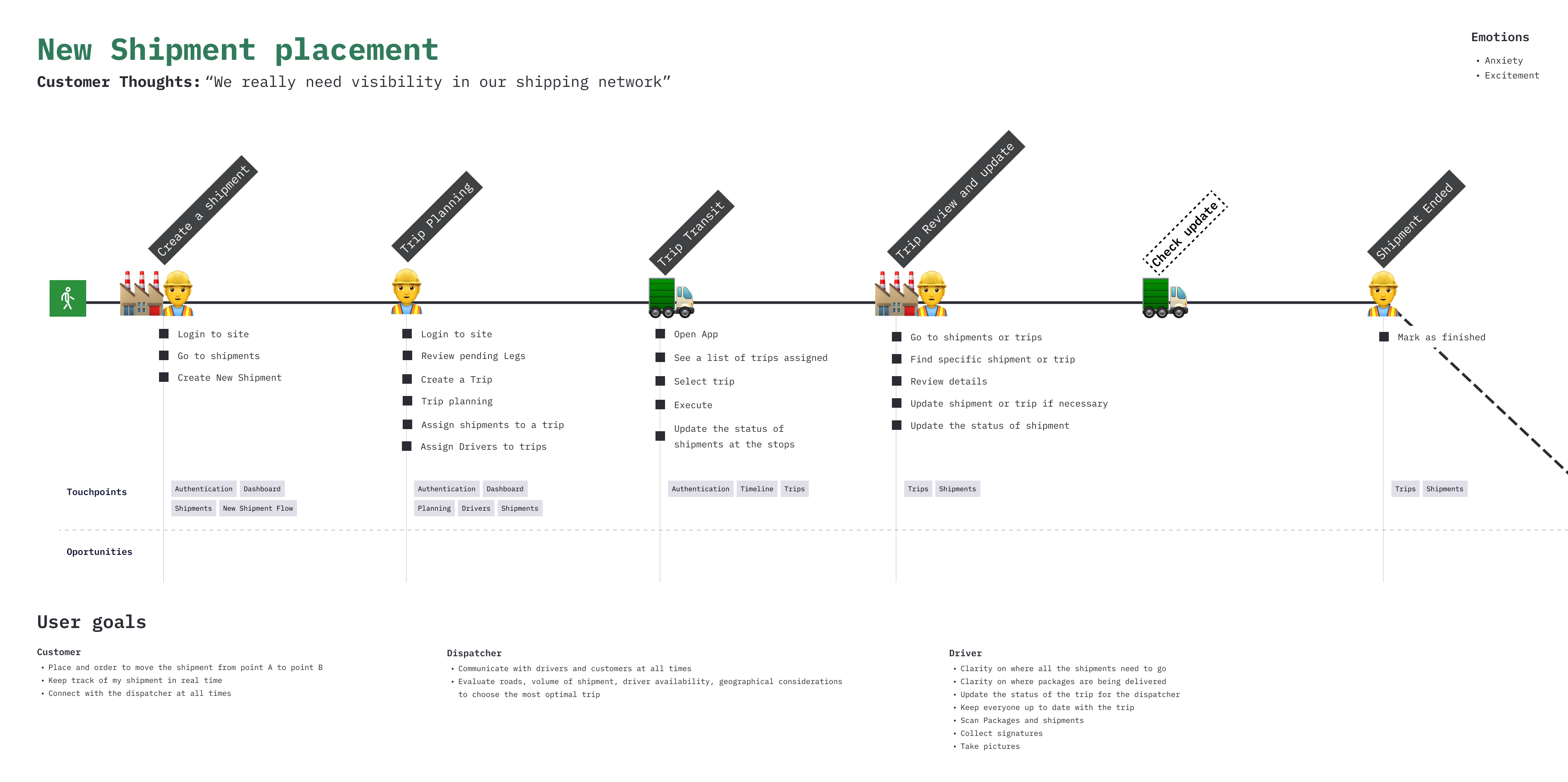
Dispatcher Portal
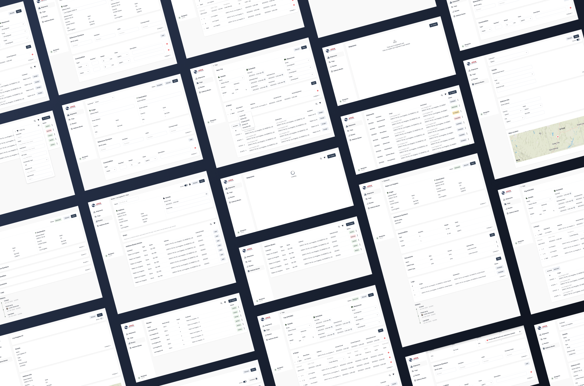
It all starts with rapid wireframing and iteration over iteration. For the dispatcher portal, the user experience was carefully crafted to optimize time spent on tasks and to handle large amount of data with ease. It was very important that users could find specific information easily among large quantities of data to make informed decisions on how to proceed.
Wireframes
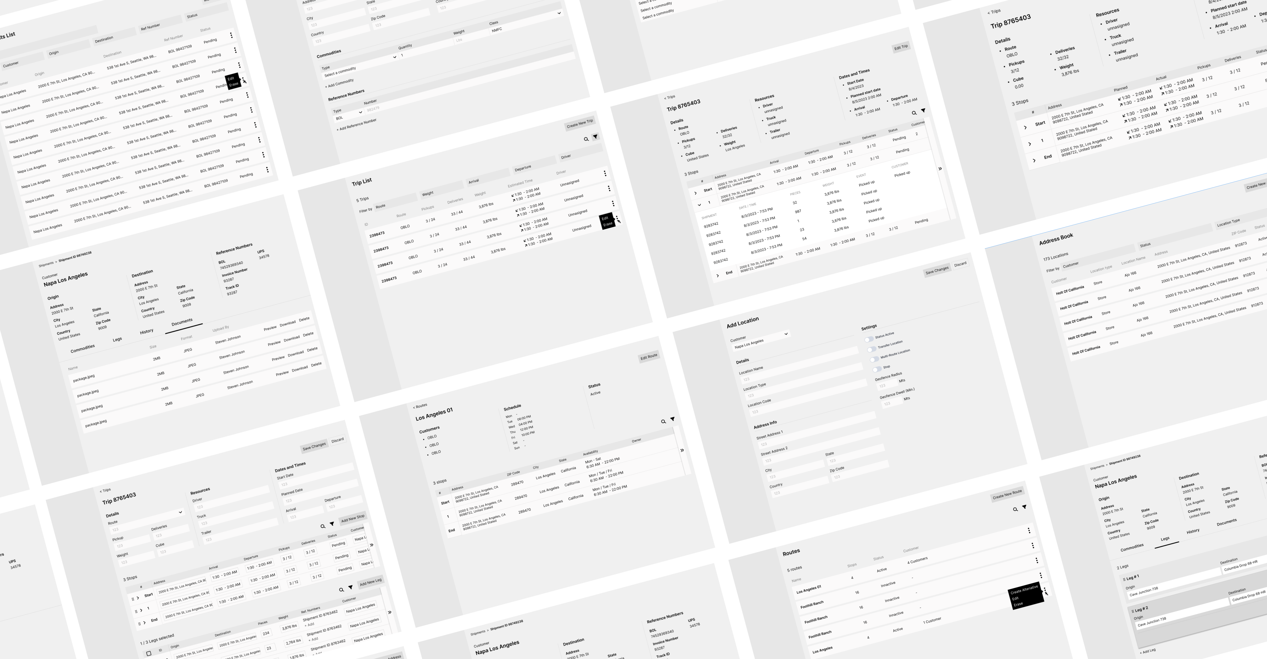
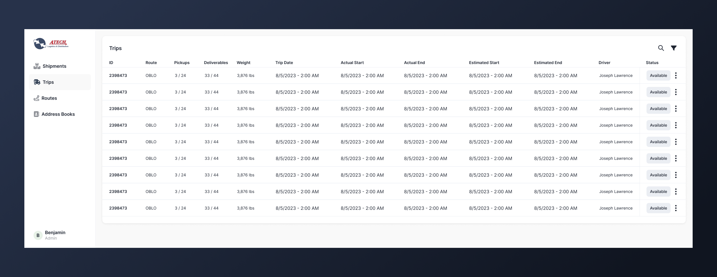
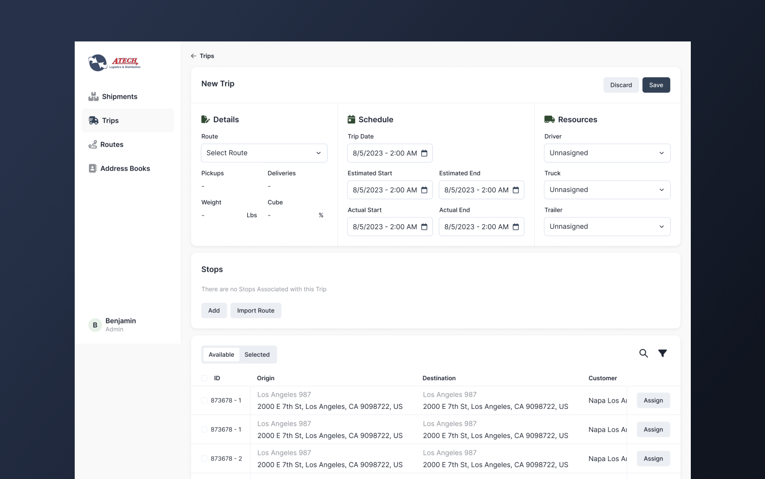
The core feature, the 20% effort that would drive 80% of the results was Trip Planning. Dispatchers needed an efficient way to define routes and allocate shipments to a single trip in order to optimize the resources while ensuring customers get deliveries on time.
Trips List
New Trip
Hi-Fi Mockups
Driver Portal
For drivers, the goal was a bit different, the user experience needed to be optimized to narrow down the focus of drivers and reduce unnecessary distractions, as well as enable them to inform the rest of the operation about the trip status and any exceptions in the road.
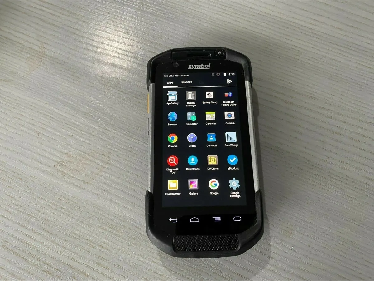
An important consideration was that drivers were using an Android Symbol device, which has a built in scanner they will use to track every shipment at the stops
Symbol Device
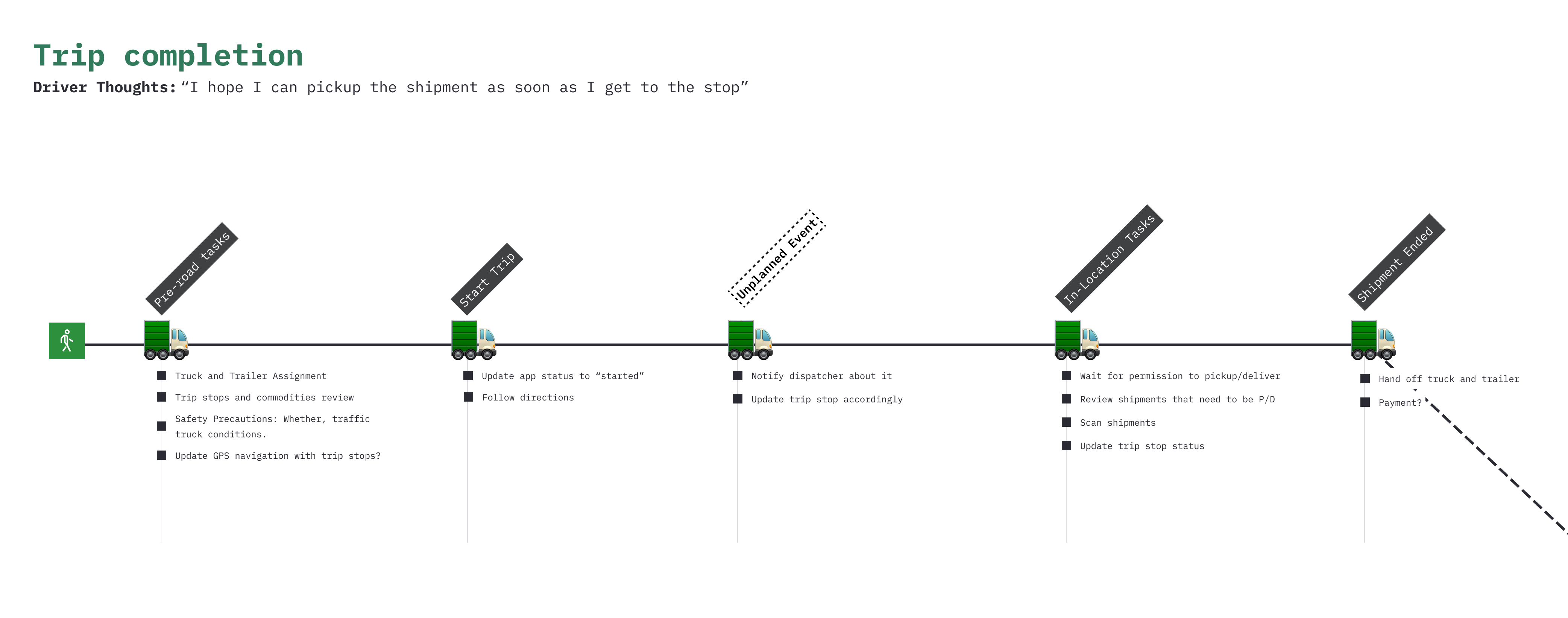
The driver's journey outside and inside the app was carefully mapped and analyzed to make sure the system could provide support in all stages of this process.
Journey
User Flow
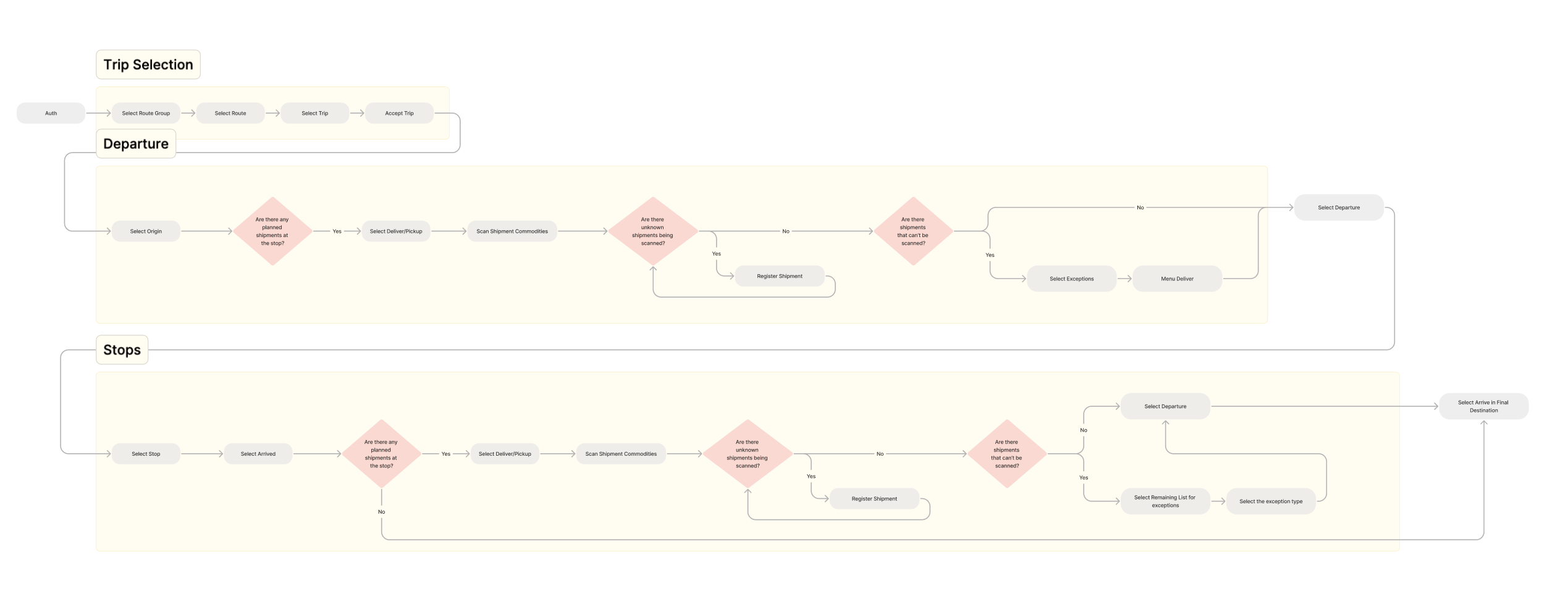
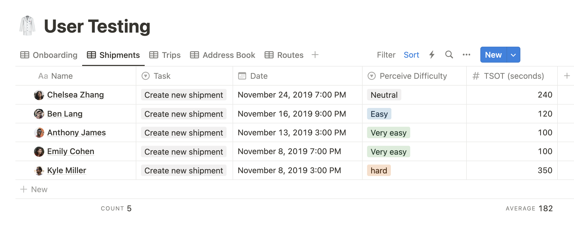
Same as with the dispatcher portal, there was a lot of wireframing and iterations to consider with low risk, what was the best approach and make sure all the functionality and use cases are being addressed. After that, I designed a high-fidelity prototype to prepare unmoderated user testing and optimize the time spent on tasks and perceive difficult
Mobile Mockups
Handoff
Unfortunately, I had to move to a different project during development and the plans for testing and iteration had to be perform by someone else. The handoff was done in Figma, Notion and FigJam with the design system in place and a testing plan to track down key metrics that will give indication of performance and opportunities
User Testing Template
