Finding a North-Star vision for Lasso's software
Role: UX designer
Date: Sep 2023 - Dec 2023
Industry: Marketing in Healthcare
ROI: Increase in user adoption, customer satisfaction and decrease in customer support workload
Context
Lasso MD is a Startup that specializes in providing online marketing solutions for high growth dental practices. I join the team in an effort to design a north-star vision for their Lead Management Software.
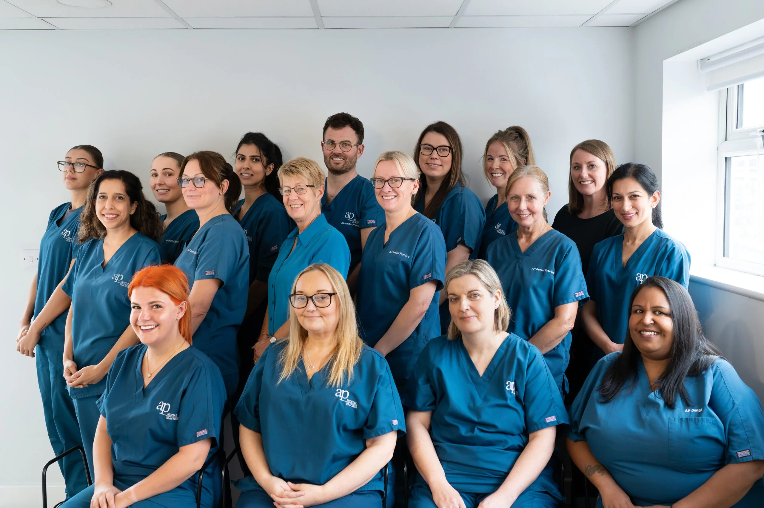
Dental Practice
Business Problem
The main problem was a lack of clarity and understanding regarding the product's purpose, value proposition, and alignment with customer needs. This lack of direction and purpose would likely hindered the development and success of the software. The team needed to address these issues to move forward effectively.
Challenge
We sailed on a trip to understand our customer's day to day marketing operations and the context of their biggest pain points in this area, the expected outcome would be to design a software that helps in their marketing journey centralizing some of the current solutions in the market but also providing an added value to differentiate and increase adoption.
Solution
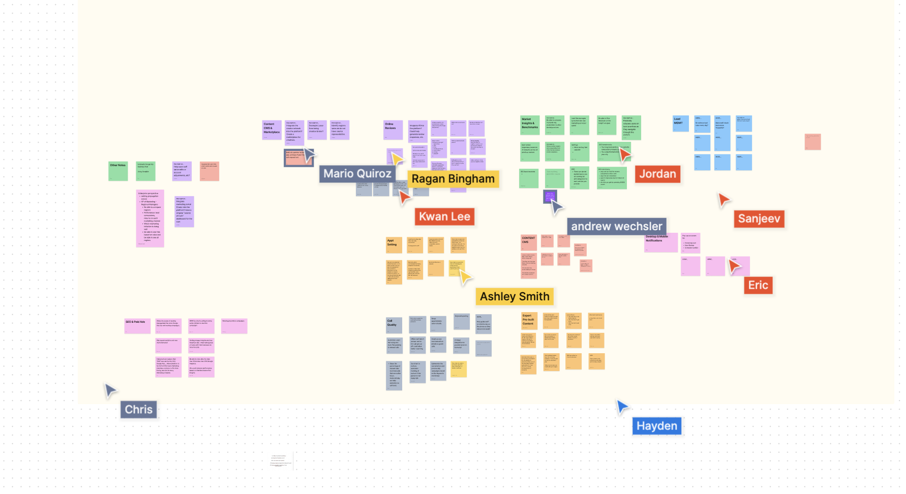
After dozens of user interviews, competitive analysis, internal discussions, and design sprints sessions, we landed on a series of use cases and features that could provide dental practices a clear roadmap to grow their business using PatientLoop and Lasso MD services.
Design Sprint
ASYMMETRIC Bets
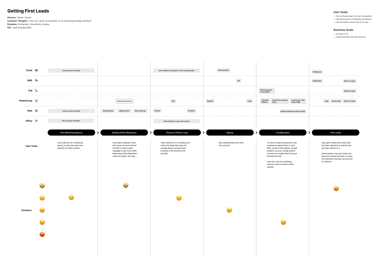
multi-channel customer journey
Design Outcome
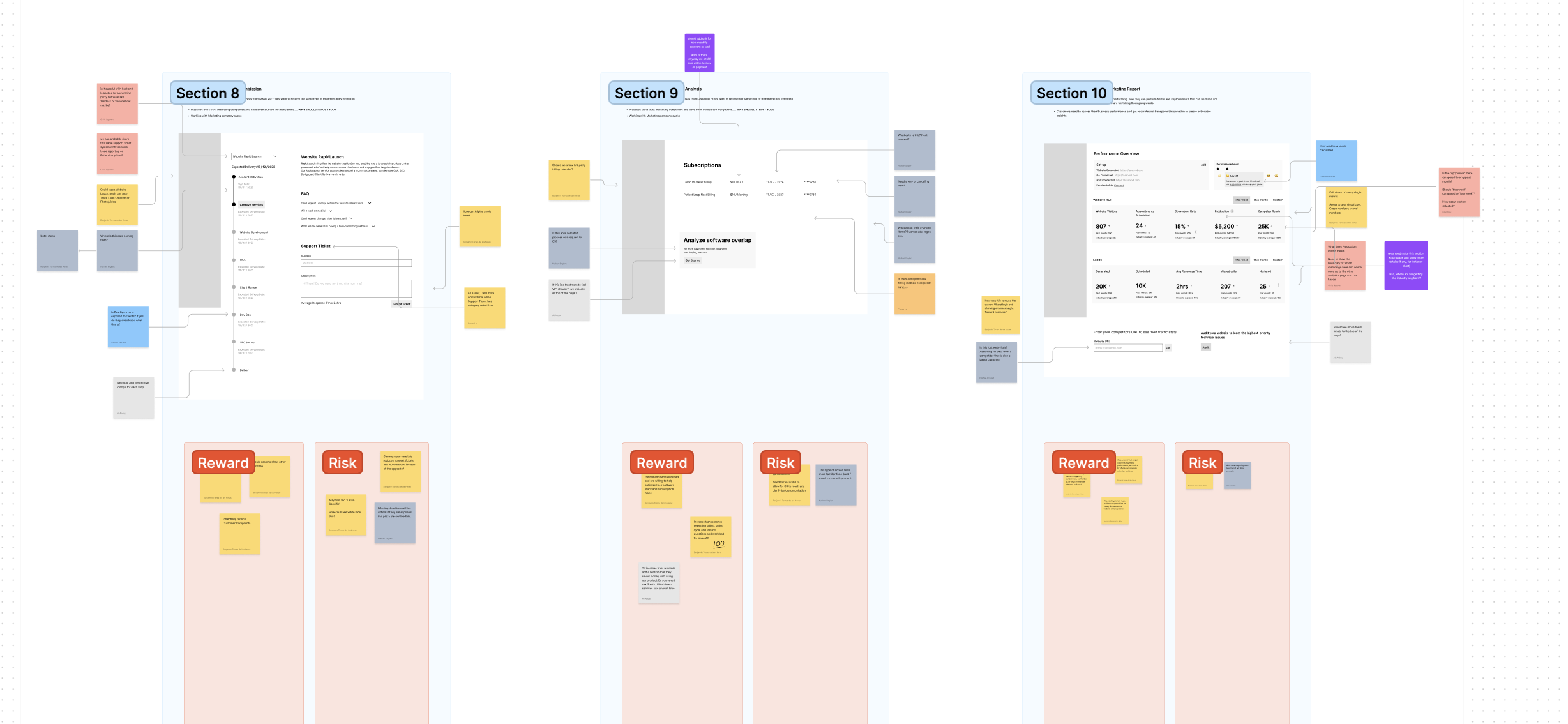
The details of the designed software are under NDA, however, I can share a general overview and a few screenshots.
We started creating documents and visual represations of the journey and complexities the business and the customers were facing.
As is usual in product development, all assets are considered living documents to continue expanding, but the outcome of starting all of these conversations
is alignment, clarity, less risk, less dramatic iterations and overall moving with more confidence
through the product life cycle.
UX Business Case
UX Roadmap
User Interviews Reports and Documentation
Personas
Multi-Channel Customer Journeys
Competitive Analysis
Opportunity Solution Tree
MVP2 Use Cases
MVP2 Scope
MVP2 Sitemap
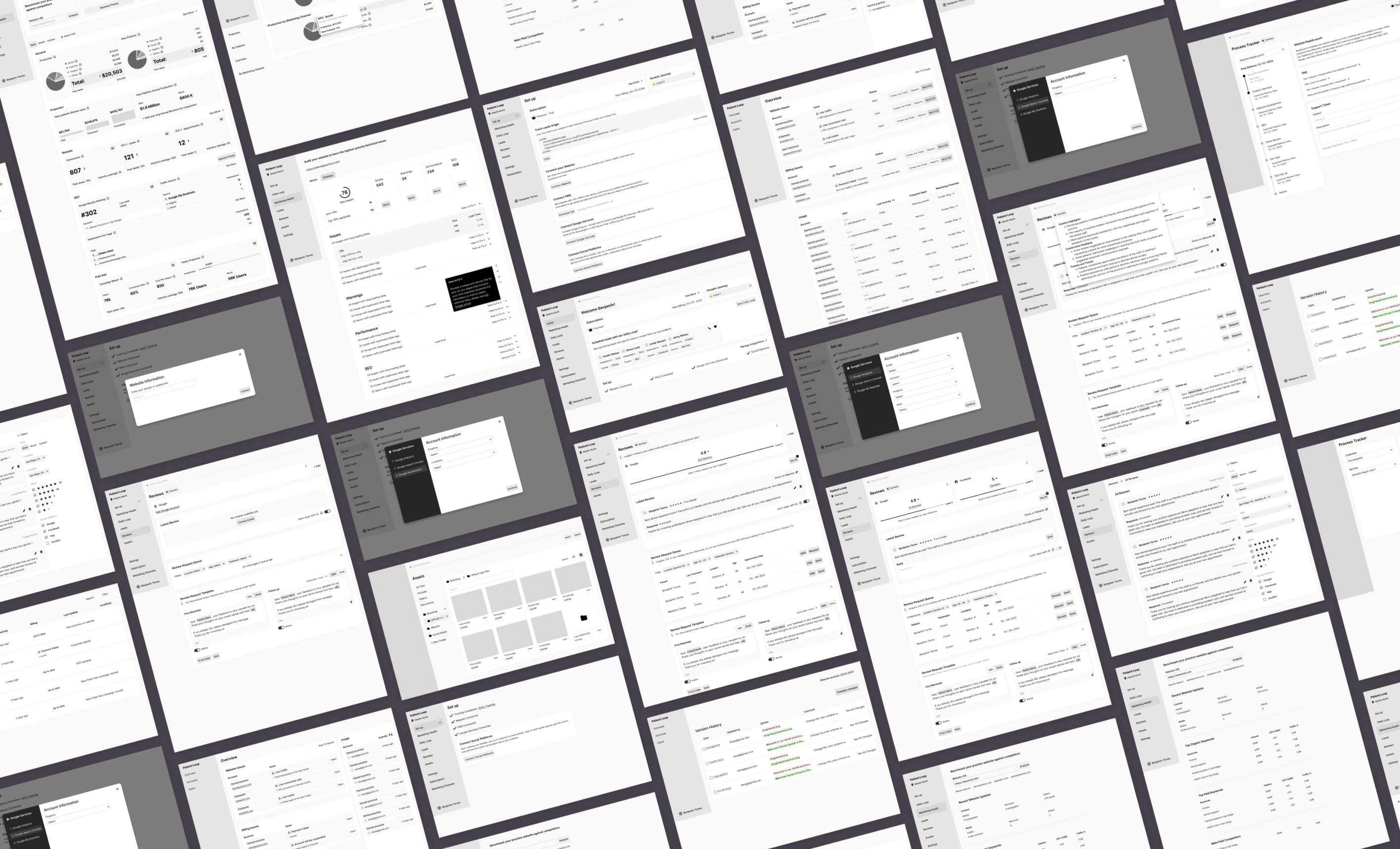
MVP2 Wireframes
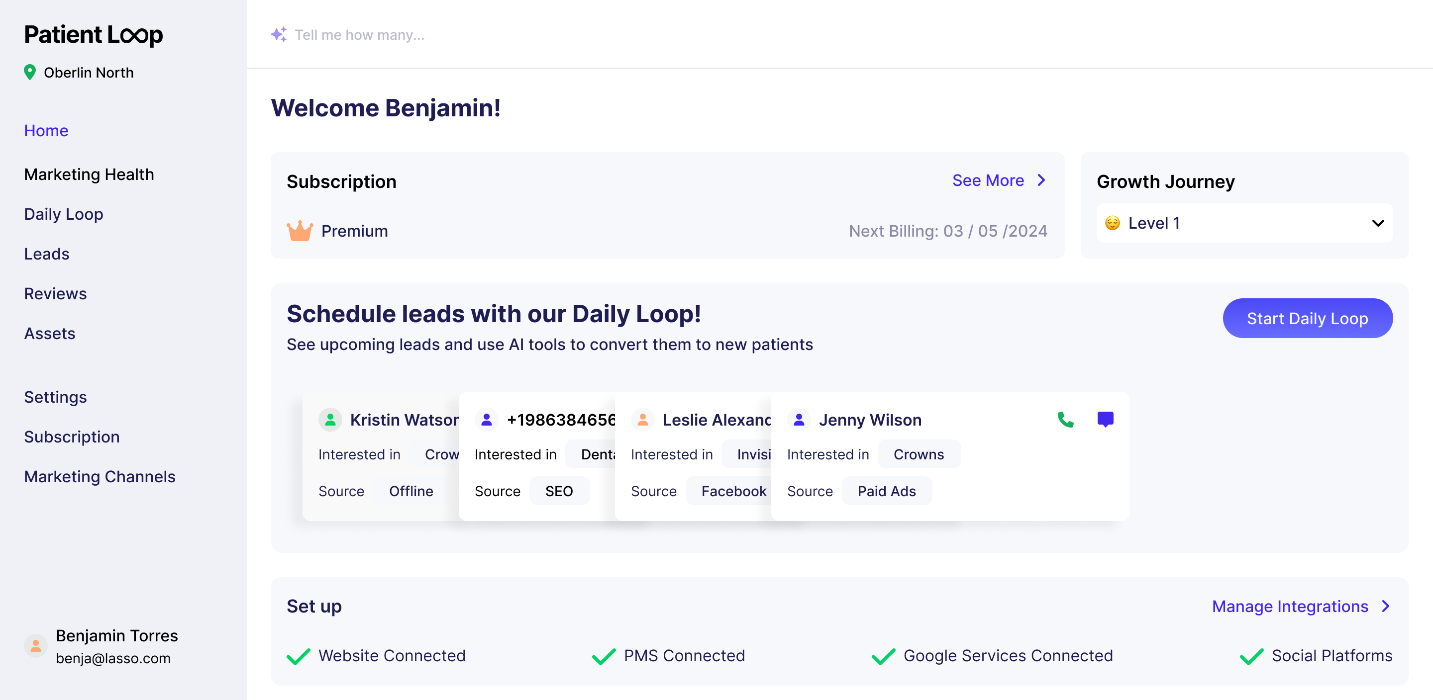
MVP2 Concept Hi-Fi Mockup (Visual Design)
MVP2 Userflows
User Testing Plan and Report Template
These assets are just outcomes of the process, that, on itself, involved many
internal and external conversations, online research, brainstorming and design
critique to level up the quality of these outcomes.
Wireframes
Hi-fi Concept Screen
How to recognize success?
The biggest indicator that design was successful would be adoption and retention rates of the product.
Prior this design effort, a beta version of the product was released, so metrics would be compare against that.
Other indicators inside the product to understand the performance of the practice and the quality of the design solutions were:
Time spent on task for multiple processes inside the app
Perceive difficulty on multiple tasks in the app
The biggest challenge
I like to think that the entire process should be challenging, if it's not,
I'm not pushing myself enough to do it better than last time, but with this project,
it was particularly challenging to find the right balance on each use case, to not directly
compite with more mature products out there, but instead, offer a set of solutions that
reduce the overlap in the practice product stack and provide more efficient results.
Another challenging task was to breakdown and prioritize the different releases of the
product development, what features could create more compound value over time and what were
the dependencies between them.
To solve this issues there was extensive competitive analysis to understand the current
market, interviewing customers about their software usage and pain points, review of
internal process within marketing services by Lasso MD, and making hard decisions on what
to focus and prioritize according to the vision and values of the company.
PMS (Patient Management Systems) is the most common software and almost a most-have
for every dental practice, the software we were designing (Patient Loop) didn't
pretended to be a replacement for it, instead it aim to be a tool that fed and
seamlessly integrate with it.