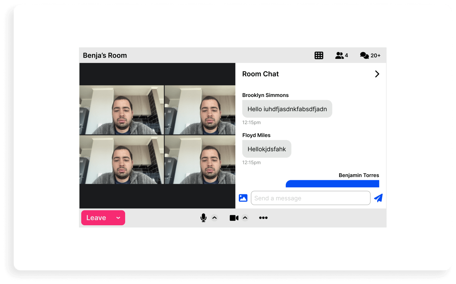
A brief story of the impact my design thinking process had at the Startup
Role: UX designer
Date: Dec 2020 - Mar 2023
Industry: Telecom
Summary: Increase in conversion rates, increase in user adoption, launch of new products.
Project: Signup/Login flow Redesign
Outcome: Significant increase in conversion rate metrics
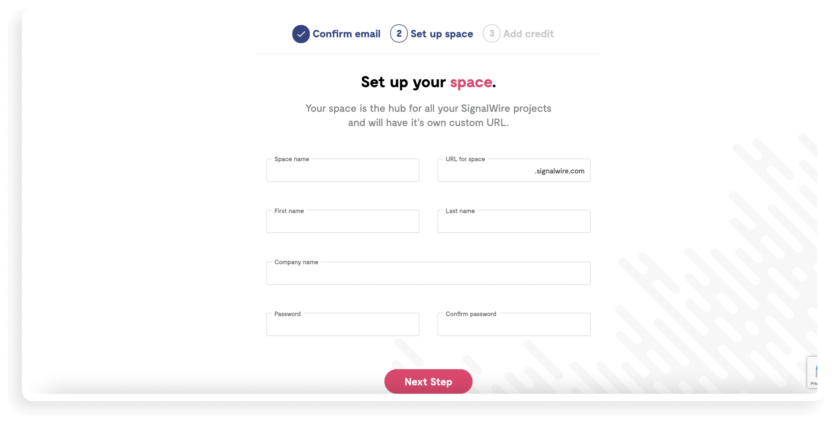
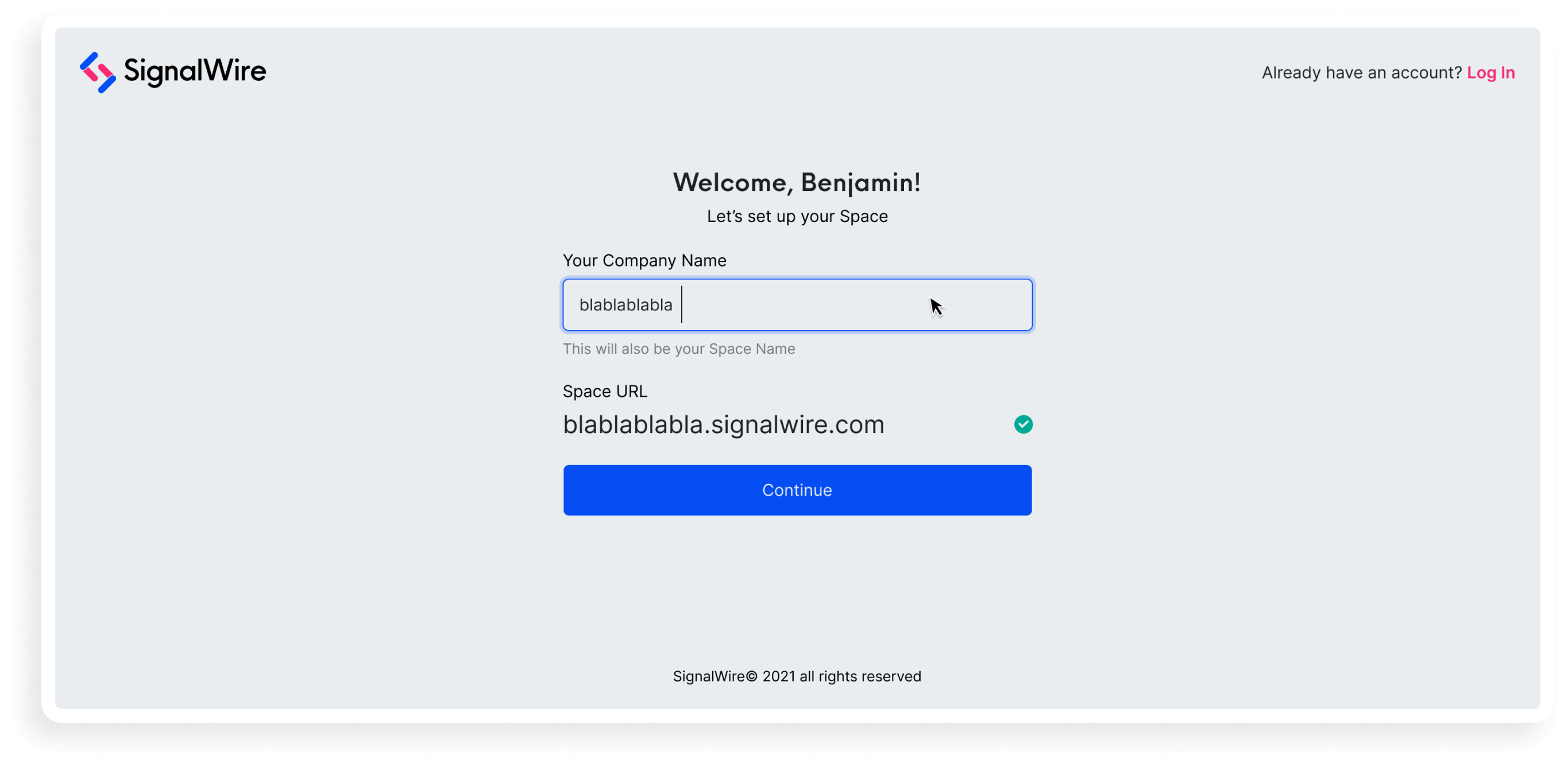
Looking to increase conversion rates on signups, I started to assess the current user-flow and used analytic tools to determine where were the dropouts and friction points. After reviewing in group the findings, I validated a few hypothesis with qualitative research and A/B testing to then propose design changes in the flow and UI. Along with the entire redesign, the screen below was a step that performed a lot better due a clever solution.
Before
After
Project: Research, validate and design new features
Outcome: Increase in user adoption
By the time I joined there was a product called SignalWire Work, it was a public MVP with over 500+ users across different instances. My task for this project was to validate through research and design new features that could potentially increase user adoption. After the discovery phase, using personas and journeys to understand the mental model of the customers, we started to brainstorm on solutions from the new user-stories we found which lead me to design several new features for this product.
Product preview
Project: New product design and launch
Outcome: Prebuilt Video API
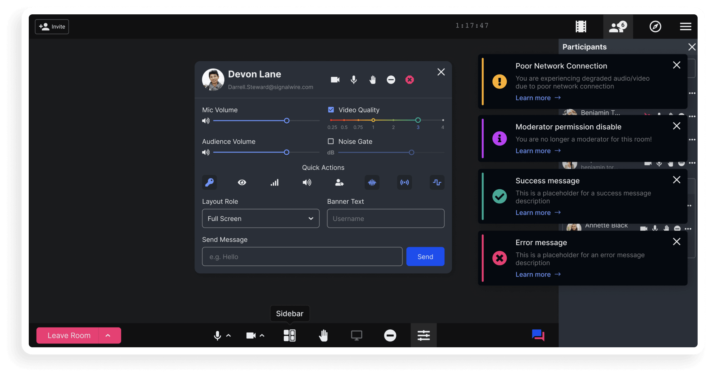
After spending a year or so designing and developing a virtual-office product,
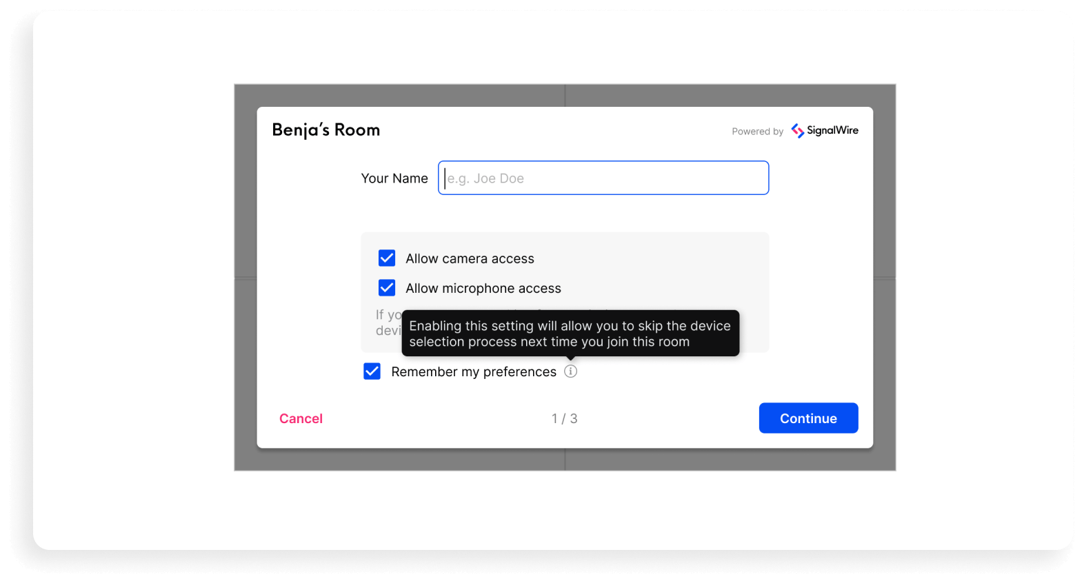
we started to craft a new vision, an API one. My task for this project was to design
a customizable and embeddable video conferencing room that could perform as a widget on
any website. The idea was to dissect the widget into small pieces and allow people to set
up and customize their own video application with prebuilt components.
Building a product with this mindset was particularly challenging and exciting because there were a lot
of considerations in terms of flexibility and scalability when you are not entirely sure how
this product will be used, so I had to plan ahead for a lot of scenarios.
prejoin
chat
